Page 3 of 4

Re: Alternative User Interfaces

Posted: Wed Feb 18, 2009 10:52 pm
by thepowersgang
I think Solar was right with the idea that what we need to do is not focus on using windows in different ways, but to expand the idea of a UI from the currently rigid CLI/GUI/FPS/etc. ideas toward a better user experience.

I once had an idea (before I had even heard the word "kernel") of a different UI type that combined a text UI and GUI into one.
At the bottom of the screen there is a "command line" prompt that controls the execution of programs and the placement of windows. I don't know if it would work well in current situations but it might be an interesting experiment.

<thinking>
  • Key combo to access command line
  • Command line like windows task manager / ctrl-alt-delete, hard to crash and has highest priority.
  • Window control scripts usable (E.g.Tile Firefox on top and Notepad on bottom)
</thinking>

I might implement this in a version of Acess and test it out.

Re: Alternative User Interfaces

Posted: Thu Feb 19, 2009 3:32 am
by Solar
JJeronimo wrote:
yemista wrote:The advantage of GUI over command line is that you can run multiple programs at once and have simoultaneous outputs going at once. I may be unimaginative, but I cant see how else you can do this other than some kind of a window, whether you call it a page or whatever.
Also, I think VTs are not very different from windows in the sense that both represent something you are working on. You can mimic the useful effect of having multiple windows with multiple VTs.
Anyone of you ever used "screen"? 8)

Re: Alternative User Interfaces

Posted: Thu Feb 19, 2009 6:40 am
by Walling
One thing that annoys me with the task bar (and where I think tabs is different) is that it is undefined whether the task bar shows single documents or single applications (with multiple documents open). I think the abstraction should be single documents (like tabs) all the time/whenever possible. I often want to change from one tab in one application to another tab in another application. It involves clicking/Alt+Tab to select the application in the task bar, then getting the overview of the tabs to see where the tab I want is located and then clicking again/Alt+Arrows to select the tab. I think it could be simpler than that. However the problem with showing single documents all the time is that you potentially get a lot of tabs. I'm not saying it's a golden solution. I just think it could be exciting to try out as an experiment.

Re: Alternative User Interfaces

Posted: Thu Feb 19, 2009 8:13 pm
by AndrewAPrice
Walling wrote:One thing that annoys me with the task bar (and where I think tabs is different) is that it is undefined whether the task bar shows single documents or single applications (with multiple documents open). I think the abstraction should be single documents (like tabs) all the time/whenever possible. I often want to change from one tab in one application to another tab in another application. It involves clicking/Alt+Tab to select the application in the task bar, then getting the overview of the tabs to see where the tab I want is located and then clicking again/Alt+Arrows to select the tab. I think it could be simpler than that. However the problem with showing single documents all the time is that you potentially get a lot of tabs. I'm not saying it's a golden solution. I just think it could be exciting to try out as an experiment.
Basically Windows/Gnome/KDE and other similar environments where every window is maximised and you use the task bar to switch the active window?

Re: Alternative User Interfaces

Posted: Thu Feb 19, 2009 9:45 pm
by thepowersgang
I think he means a unified system with either all Word documents being tabbed like in Firefox or all Firefox documents being on the taskbar, not having both ways.
Personally I think that for some cases it can be beneficial for a single application to have a taskbar item for each document, but it would be better if everything used local tabs. (Firefox, Notepad++ style)

Re: Alternative User Interfaces

Posted: Fri Feb 20, 2009 2:50 am
by xenos
A unification of the concepts "one taskbar entry per application" and "one taskbar entry per document" could be a nested taskbar. In the taskbar, there is an entry for each application that is currently running. If you put the mouse over this entry, a small menu opens, showing the tabs / documents that are open in this particular application. Clicking on one of these menu entries switches not only to the selected application, but also chooses a particular tab or document.

Doing it this way, the number of entries simultaneously shown in the taskbar is kept small, while still having access to all opened documents via the taskbar. Adding some keyboard shortcut(s) for browsing opened documents (similar to Alt + Tab for application browsing in Windows) makes the whole thing even more useful. For example, one could use Alt + arrow keys to navigate within the menu. (Yes, I prefer using the keyboard for application / tab / document switching.)

Re: Alternative User Interfaces

Posted: Fri Feb 20, 2009 4:13 am
by Combuster
berkus wrote:I personally believe that something like Mac's Exposé is the way to go for desktop - swing your mouse in the corner and get an overview of all windows.
While that kind of featuree is awesome (Not a mac user, but compiz has it too), it happens a bit more than often that I go for the close button, accidentally overshoot it, and then can go looking where my window went.

Now if could configure it to happen when I go off the left edge of the screen...

Re: Alternative User Interfaces

Posted: Fri Feb 20, 2009 10:41 am
by Colonel Kernel
XenOS wrote:A unification of the concepts "one taskbar entry per application" and "one taskbar entry per document" could be a nested taskbar. In the taskbar, there is an entry for each application that is currently running. If you put the mouse over this entry, a small menu opens, showing the tabs / documents that are open in this particular application. Clicking on one of these menu entries switches not only to the selected application, but also chooses a particular tab or document.
Is this what you mean?

Re: Alternative User Interfaces

Posted: Mon Feb 23, 2009 2:38 am
by xenos
Indeed, that looks quite smilar to what I've been thinking of. In addition, it would be nice if the user could choose between using several SDI windows (as shown in the video) or one MDI window. For the MDI window, moving the mouse over the taskbar entry could show the open documents in a similar way, and clicking on one of them would switch to the MDI window and bring the selected document to the top. (In general, I prefer MDI.)

BTW, I think the possibility to move taskbar entries around and to put them into a different order would be a nice feature... I love having taskbar entries always in the same order, so they somehow represent the workflow. Starting with a source file editor on the left, then some console to run the compiler and finally some CPU simulator to test the result on the right. If one of these has to be restarted, defaulting to put its taskbar entry to the right hand side may be a good idea, but the user should at least be able to drag the entry where he wants it.

Another thing I like is using large virtual desktops. Of course, having completely separated virtual desktops is a nice feature, but I prefer having them "glued together" to one large virtual desktop. It allows you to drag windows around, go from one part of the virtual desktop to another just by moving the mouse and even open windows that are larger than the physical screen without putting parts of them out of reach. An even nicer feature might be having several of these large virtual desktops ;)

Does anyone still remember or even use FVWM2? I know, it's quite outdated, but it's still my preferred WM.

Re: Alternative User Interfaces

Posted: Tue Feb 24, 2009 12:51 pm
by overburn
you just can't get rid of windows or simmilar gizmoz. call them viewports if you want.
there isn't any alternative that would provide the same ease of use. maybe a direct brain link would be one, but i don't see that happening on a large scale for another 10-20 years.

the current windows could be improved, redesigned, etc, but that's it. except if you want a command line os.

Re: Alternative User Interfaces

Posted: Tue Jul 08, 2014 10:08 am
by AndrewAPrice
Major necroposting here, and I was debating with myself if to necropost, or start yet another thread on the same topic.

It has been some 5 years. Since them, I've used different user interfaces - Android and iOS smartphones and tables, XBox Kinetic and voice control. In September, hopefully I'll receive my Oculus Rift.

Very much about window management and user interface is about multiplexing the display. We often associate multiplexing the display with multitasking. This is not always true, for example, I can multitask on my Android smartphone (I can play a song in the background, have a file downloading, browse the web, while my Twitter notifications pop up) - all without multiplexing the display - having one application use most of the screen at the time.

You can also be productive in a non-display-multiplexing environment. I have an iPad and a Bluetooth keyboard. If there was a decent iOS source code text editor, I think I could write code productively. I can browse the web, post on this forum, do research, and play games productively on an iPad without multiplexing the display.

Now, multiplexing the display is useful. In Visual Studio, I like to have a header file and source file side-by-side (or two source files if I'm comparing code) - even better is when I can have each open on different displays. It's also useful to occasionally have API documentation on a different screen, or if you're developing a graphical program, have the running program and debugger/code displayed simultaneously.

I don't believe that windows - those little boxes that programs can draw to that can be arbitrarily resized and moved - are the only way to multiplex a graphical display device.

I feel that windows are fairly clunky, but we've gotten use to them so we deal with them. When we open a program, we need to move it around and resize it to where we want. It's become a learnt behaviour we don't really think about it. But I remember when my mother started using a computer (1990s, and even into the early 2000s) when a program opened, such as a spreadsheet or web browser, she would use the program where it popped up (even when she knew how to 'maximize'), even if it only covered about 70% of the screen.

There are also those awkward moments in high school and university where the teacher would open a program on their laptop (connected to a projector), and while standing and attempting to teach a class they would inefficiently move windows around on the mouse pad with one hand, trying to get both things they want to show on screen at once.

It's even less intuitive/efficient on other devices. For example, imagine if on a television, every time you switched a channel - a new window would pop up that had to be resized and moved? It's very awkward thing to attempt to do with a remote - even televisions that do allow you to multiplex the display by having picture-in-picture usually limit you to a handful of layouts:
Image

On smartphones and tables, even ones with fairly large screens, it's intuitive for the application simply to take up the entire screen by default - it would feel much less productive if we're going for a jog or giving a presentation, and when we open an application having to resize or maximize the window, and get frustrated with 'window hell' if we have a dozen or more applications open. Yet we tolerate it on a PC.

Modern Android (I believe versions 4.x+?) does allow you to multiplex the display:
Image

Rather than using windows, they simply split the screen, allowing an application on either side and the ability to drag the splitter. The usefulness is limited on smart phones, because if the screen is already small and limited, that multiplexing it into a smaller and more limited screen has little practical appeal.

But, I do like how Android is very minimalist. A phone has a limited screen size, and by default, all applications take up the entire screen (with the exception of the notification bar) - and even when you multiplex a display, it still tries to be very minimalist. Screen real estate on a mobile display is a premium, and pretty Window decorations, would take up valuable screen real estate, leaving less for the actual application to do something productive with:
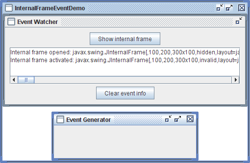
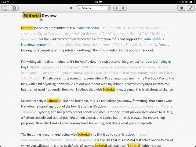
Image

Imagine that on a 3.5 inch mobile display! Even with some phones now having high resolution displays that rival workstation monitors, we can have pretty window decorations that take up very little physical space, however if the window decorations are smaller than our fingers that we can't select or manipulate them, the only purpose of the window decoration would then to display the name of the running application and/or document, but the usefulness of this is limited because when you only have one application on screen at once, you generally remember which application you just opened.

Then there are times when window decorations and other UI fluff just get in the way. For example, at work, we often have a leader bring in their laptop and plug it into a projector to show us a spreadsheet. However, the projector defaults the resolution to something like 800x600, and with the task-bar, window decorations, and toolbars, very little of the screen is left to actually show the spreadsheet;

Image

That leads to a lot of counter-productive scrolling. You could possibly develop a spreadsheet program with a full-screen mode that tells the OS to hide the UI fluff (window decorations and taskbar). Alternatively, we could design our UI (both the application and OS) with as minimal 'fluff'/decorations from the get-go;
Image

It may not be perfect, but you could show that on a low resolution projector, small mobile screen, or a large high-resolution workstation monitor, and still have the majority of your display showing your actual data (the spreadsheet) rather than UI fluff.

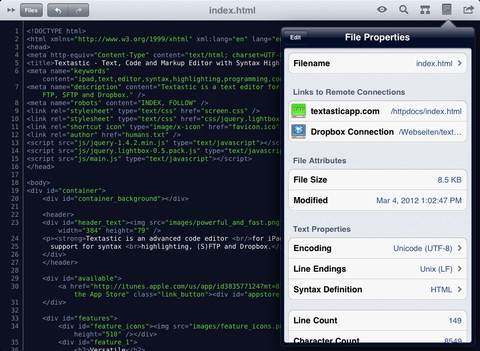
This is not just about spreadsheets, but the same is true when browsing the web, watching a video, or writing code, or playing a game. I want as much of the display showing what I'm working on, rather than fluff. A lot of tablet applications do this very well, because they're designed to dedicate as much screen space as possible (minimizing UI fluff) while still being productive:
Image

This post is long enough so I'm going to continue in my next post incase I accidentally close my browser and loose everything!

Re: Alternative User Interfaces

Posted: Tue Jul 08, 2014 10:28 am
by AndrewAPrice
When only one application is open, we're not multiplexing the display, and so having a window that can be resized and moved around is largely irrelevant;

Image

If we're not multiplexing the display, then there's very little reason why we would want the application displayed in a small window, rather than taking up the entire screen by default;
Image

If I have two applications open, and want to see both simultaneously, it's very unlikely that I want to see both in two very small windows:
Image

I'd want both applications utilizing the screen efficiently, still with very little UI fluff;
Image

Re: Alternative User Interfaces

Posted: Tue Jul 08, 2014 11:09 am
by AndrewAPrice
I'm going to talk about what I view as an alternative and hopeful productive improvement to 'windows'. This alternative, to be productive, needs:
  • Very little wasted space: If we're viewing it on a tablet screen, workstation monitor, or projector, we need to display our data productively with as very little UI fluff as possible.
  • Very little wasted space (2): If we only have a single application, then we're not multiplexing the display - there's no point in it not being 'maximized'. If we want to see two or more applications simultaneously, there's no point wasting space with the 'desktop' peeking through behind.
  • Very little messing around. Avoid window after window popping up that have to be re-positioned. We should be able to switch between changing the entire screen between our game and our video player. If we have two programs shown simultaneously, and want to keep our text editor on the left, we should be able to switch between changing the web browser on the right to our audio player.
I like tiling window managers:
Image

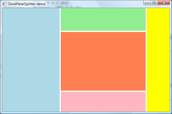
But, I feel that the Visual Studio-style 'docking' interface could be an improvement upon this:
Image

Granted, the VS-IDE is also very cluttered with toolbars and fancy decorations, but if you ignore all that and focus just on the docking, it's very intuitive. The workspace is split into 'panes'. When you first start VS, there is only a single central pane. When you open multiple files, they all open as separate tabs of the single pane - not as separate windows - effectively not multiplexing the display (ignoring the VS UI-fluff) and you can switch between open files by switching tabs. You can also drag the tab and split the pane into two (either vertically or horizontally) to show different files side-by-side, and drag your tabs between different panes to group them together.

It's very intuitive and easy to pick up. A basic user that does not realize you can split the panes can still efficiently work with multiple files by tabbing between them, and the 'workspace' is always 100% utilized (ignoring the VS UI-fluff around the outside again). When a pane has no more opened tabs, it merges back into the larger pane (unless it is the root pane.)

Image

My idea for a more productive and intuitive alternative to window management would be a 'docking window manager' that imitates VS-style docking. As soon as the user logs in, each attached display has one pane covering the entire surface. When you launch an application, it opens in the default pane on the first monitor - effectively 'full screen'. When you launch another application, it also opens in the same pane as a new tab. No display space is wasted, and the display is not multiplexed by default. However, you can drag the tab, splitting the parent pane in half, multiplexing the display. You can also drag the tab to another monitor, allowing dual screen.

Launching a new application opens it in the last previously focused pane, while closing all tabs in a pane merges that pane into the parent. (If nothing is opened in the parent pane - then you can show the desktop wallpaper.) There will never be a time when only half a screen is utilized.

My vision is to combine a flexible docking window manager with general UI guidelines for smart phones/tablets/smart-TVs for minimizing UI fluff - that emphasizes screen real estate on the 'data' you want.

Image

Re: Alternative User Interfaces

Posted: Tue Jul 08, 2014 12:32 pm
by AndrewAPrice
Earlier I was talking about screens with limited sized displays (tables, smartphones) or inputs (televisions, game consoles).

A docking window manager would be much easier on smartphones and tablets, because of the lack of precision of touch screens. It would be much simpler to drag a tab to the left or right half of the screen (or anywhere else) and simply have it dock into that pane, than dealing with moving and resizing borders with big fingers on a small screen.

There is still 'pane decoration':
Image

Which may be acceptable on a high resolution large workstation monitor, but on a display that's limited in resolution or physical size, you'd probably want to hide as much as this 'fluff' as possible:
Image

I've you've ever tried multitasking in iOS or Android, you know that your open applications are never visible while you're actually using one. You need to either press a button or gester to show your open applications:
Image
Image

On a PC, we always display the windows and decorations, whether we're watching a film, playing a game, or editing a document, while on a tablet or television, we would find it annoying if there's always window decorations around what we are doing.

There's no reason we cannot learn from this for workstation operating systems, and hide the pane decorations:
Image

And show them when the user requests them, such as pressing a key (the Windows key?) or gesturing (right clicking a pane border?):
Image

Perhaps panes decorations should be are togglable (Scroll Lock?)

Re: Alternative User Interfaces

Posted: Tue Jul 08, 2014 2:50 pm
by Love4Boobies
I haven't followed the thread but I'm posting this video here since it's relevant to the title but I've more or less lost interest in user interfaces (or operating systems for that matter) so I haven't explored it further. In principle, it'd make an interesting way to implement UNIX pipes in a GUI environment.