Font creation/rendering

Discussions on more advanced topics such as monolithic vs micro-kernels, transactional memory models, and paging vs segmentation should go here. Use this forum to expand and improve the wiki!
User avatar
BenLunt
Member
Member
Posts: 941
Joined: Sat Nov 22, 2014 6:33 pm
Location: USA
Contact:

Re: Font creation/rendering

Post by BenLunt »

Hi guys, just an update.

I tried the simple way Brenden mentioned before, a technique I was thinking of as well, but found that it may not work as well as I had hoped.

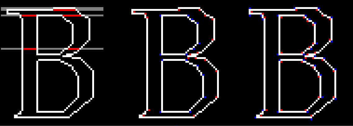
Below is an image of three glyphs. I will discuss the first glyph, the one on the left, first. (sorry for the size, but I needed you to see the red and blue dots clearly)
Image

In the first image, you will see that the grey lines is the code starting from left to right checking for a boundary or border. The first line finds a long border, so for the sake of argument, let's assume that it is a horizontal border and not "turn on" drawing.

The second line, finds another long horizontal line and so would assume another horizontal border, but if you will notice, should turn on drawing, noted as the red line. (second line from top).
If done with the assumption given from the first line, the actual output would be as such.

Image

Looking back at the original image, the third line drawn (actually five pixel lines down) is correct. However, look at the pixel line shown about half way down. It has two pixels as a starting border. The question is, how many pixels indicates a border? The answer: There is none. You cannot assume anything about the length of horizontal pixels of a border.

Scratch that idea. So much for keeping it simple.

So, let's look at the second glyph in the first image above. Assuming (there is that word again) that the border is drawn in counter clock-wise directions for the outside borders and clock-wise for the inside borders, one could place a "notification" pixel to the "inside" of the border for each point (red for clock-wise, blue for counter clock-wise). Then you can simply use a "paint bucket fill" algorithm and "paint" each notification pixel location. However, this is not the case. A glyph is not guaranteed to be clock-wise/counter clock-wise drawn.

Scratch that idea. So much for keeping it somewhat simple.

However, something I noticed. Look at the last glyph in the image above. No matter the direction the border is drawn (clock-wise or counter), if I place a blue pixel on the right (directional) of the point and a red on the left (directional) of the point, there is always at least one of each color of the "notification" pixel on the inside of the glyph. The "outside", the portions not to be filled, only have a single colored notification pixel. Therefore, if the points are ordered from left to right, place the notification pixel colors accordingly. If the points are ordered from right to left, again, place the notification pixel colors accordingly.

Now for each red pixel found, simply using the "paint bucket fill" algorithm, start looking for blue pixels. If a blue pixel is found, fill in the current found area. For every red pixel that does not find a blue pixel, delete the red. Do the same for the blue and you should be able to fill almost every glyph found.

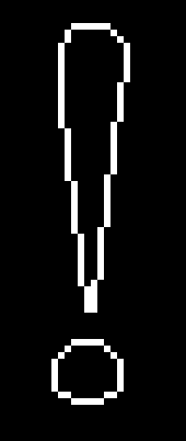
** Maybe **. I might just give this a try and see. (note, though, it will not work on single "contuored" glyphs, such as:
Image

Ben
simeonz
Member
Member
Posts: 360
Joined: Fri Aug 19, 2016 10:28 pm

Re: Font creation/rendering

Post by simeonz »

I admit that I don't have experience with drawing fonts, thus I may be way off in my judgement, but... I would be reluctant to use post-rasterization information. Especially since the initial rendering of the outline here is done by simply drawing each contour separately, without processing of sub-pixel intersections. Neither does it leave enough additional information that could be used to recover the shape test later. Rasterization erases information and considering that the countours could act like space filling curve at small point sizes, and that they could interact (possibly multiple times) in such densely filled regions, I think decoupling the contour drawing from the shape filling will be error prone.

After vaguely familiarizing myself with TT, I conclude that the drawing is very generally posed as is, with no assumptions that could offer shortcut to the drawing engine. For example, the specification does not appear to rule out contour intersections. They even have shown such (quite arbitrary) intersections in a graphic here (the one with the discs). I have not found requirement prohibiting self intersection either. Not that I expect any real fonts to use such, but you couldn't rule it out, formally speaking. Additionally, as Sik wrote, the fill test is done on "not zero" rather than "positive", meaning that clockwise and counter-clockwise annihilate each other on intersections, but both constitute a fill region on their own (that is - in their exclusive part). To top this off, the contours use bezier curves (understandably), which you may not be processing just yet. Or you have found fonts that use none. It would however explain why some of the letters on the pictures look rather rugged. This also poses a design choice - how do you process the curves will determine the complexity of the geometry problems later. You could do so by approximating the bezier equations with piecewise linear ones or use them directly as such when performing intersections and sorting points.

All of this means several things. There will be a lot of geometry processing. I cannot offer specifics at the moment, but at the very minimum it will involve solving for segment intersections - lines and possibly bezier curves. A line sweep algorithm for segment intersections seems promising, because it would synergize well with scanline raseterization. Because most shapes lack any intersections at all, and have simple inside and outside contours, the algorithm should preferably handle trivial cases efficiently. From what I remember, line sweep algorithms usually involve sorting the edge endpoints vertically, from maxima to minima (which for bezier curves are not actually only the endpoints). This simplifies the search for intersections significantly when the plane is swept by the scanline, the said points are encountered in sorted order and each segment is only tested the first time it is "encountered" by the plane sweep, only against neighboring segments. (Edit: And later after the intersection points are reached, the intersecting segments are rearranged and retested, but it's still a faster approach.) Of course, there might be better novel techniques. In this regard, the wikipedia article I linked to is where I would start searching. (I will take this further on my own, of course, but my exploratory approach may take some time. By the way, there's a rather nice python library for font data parsing, for whoever is interested in python prototyping. It comes with a tool for making an xml dump from any supported font file.)

Lastly, you have a choice on how to cache the glyphs. Whether to cache the rasterized result or the geometry output. The former (edit:meant latter) would only make sense if you support sub-pixel "pen positions" and I am not sure whether and how this is supported - i.e. whether you round up the advance width or the grid-fitting code (if present) can round it up, or you are supposed to add it as is and reexecute the code every time you encounter the character at a different pen sub-pixel offset. In any event, text at small point sizes would encounter the same character many times, i.e. will have decent cache utilization, while text at large point sizes will have more favorable ratio of the rasterization to geometry work (cached or not). So, I suspect (but things have to be benchmarked) that the cost of handling edge intersections may be masked out in practice.

Some links that I used:
TrueType Reference Manual
TrueType fundamentals
FreeType Glyph Conventions (not a TT spec obviously, but has some general information)
An introduction to glyphs, as used and defined in the FreeType engine (interestingly, super-titled Glyph Hell)
Glyph Conventions (duplicates a section from the FreeType manual, but better page layout)
User avatar
Sik
Member
Member
Posts: 251
Joined: Wed Aug 17, 2016 4:55 am

Re: Font creation/rendering

Post by Sik »

simeonz wrote:For example, the specification does not appear to rule out contour intersections. They even have shown such (quite arbitrary) intersections in a graphic here (the one with the discs).
That one actually is explicitly handled: that's what the "not zero" stencil test is for (and it may be possibly better to rasterize one contour at a time then look at the final outcome to determine if a pixel is opaque or not). The problem is this one:
simeonz wrote:I have not found requirement prohibiting self intersection either. Not that I expect any real fonts to use such, but you couldn't rule it out, formally speaking.
I checked in FontForge and self-intersecting shapes are meant to remain opaque at the intersection. This screwed up one of the suggestions I was going to say yesterday (and eventually gave up on posting it): a common method to draw polygons* with arbitrary shapes is to go through every row then toggle between "filled" and "not filled" every time it crosses a line. But when a polygon does a loop and self-intersects then the intersection will be empty, not filled in. Whoops.

The above can actually be modified so every line indicates whether it points "inside" or "outside" the polygon (i.e. which direction it's going in the contour), and then you have a counter that goes +1 or -1 every time it crosses a line (depending on the line's direction). But then you need to come up with a way to figure out which side the line is pointing to. On the flipside, solve this and it probably solves glyph rendering altogether.

*Yeah there's also the issue of curves but those can be approximated down into multiple lines if really needed.
simeonz wrote:Lastly, you have a choice on how to cache the glyphs. Whether to cache the rasterized result or the geometry output. The former (edit:meant latter) would only make sense if you support sub-pixel "pen positions" and I am not sure whether and how this is supported - i.e. whether you round up the advance width or the grid-fitting code (if present) can round it up, or you are supposed to add it as is and reexecute the code every time you encounter the character at a different pen sub-pixel offset. In any event, text at small point sizes would encounter the same character many times, i.e. will have decent cache utilization, while text at large point sizes will have more favorable ratio of the rasterization to geometry work (cached or not). So, I suspect (but things have to be benchmarked) that the cost of handling edge intersections may be masked out in practice.
Chrome caches rendered glyphs (in fact, groups of glyphs, probably depending on kerning), so there's probably some merit on it. And I know this is the case because I was making a font and testing it as I was adding glyphs and then got foiled when Chrome would refuse to update any letter that had ever been displayed until I closed the browser and reopened it (no, not even a hard refresh would override it, argh).
simeonz
Member
Member
Posts: 360
Joined: Fri Aug 19, 2016 10:28 pm

Re: Font creation/rendering

Post by simeonz »

To add to my earlier post. The algorithm I was describing earlier is the Bentley–Ottmann algorithm for finding intersections. However, after some more research, I need to retract a little, because font drawing engines appear to avoid computing intersections at all. For the anti-aliased case, they may sacrifice some quality to do so, but without anti-aliasing, there is simply no need for proper segment ordering.

There is an overview of the FreeType rasterizer in the its repository here. First thing to note is that they break bezier curves into "y-monotonic" parts. Indeed, doing so should make them equivalent to line segments in the restricted sense that they can intersect each other and the scanline once per part. Glancing through the source code reveals that it is pretty much Brendan's description. That is, they keep the coordinates at which a given segment - line or bezier curve intersects the scanline and the direction of that segment - up or down. This enables them to compute the "winding number" of each pixel. In that sense, my intuition was wrong, because although they don't exactly flood fill the raster after drawing the outline, they still perform independent rasterization for each segment. In fact, although FreeType uses a different approach, I think that degenerate cases aside (for which TT requires special handling), a rasterizer could output directly to a surface storing one winding number delta for each pixel. This is the difference from simply filling in the outline. Normal rasterization turns pixels on or off and combines segments essentially as an "or" operation between the different contour pixels. The winding number test cannot be recovered from this result, while here the segments are combined by adding or subtracting to a per-pixel number based on the direction of the drawn segment, which becomes a winding number delta. Then you could iterate through a row of pixels, keeping a running sum to get the winding number at any horizontal position. Other than that, they use Bresenham for rasterizing lines, and iterated subdivision for bezier curves. There is no need to compute intersections, because the information is not relevant for the winding number of a particular point, which is what a rasterizer like this needs.

The anti-aliasing engine of FreeType again avoids computing intersections using a "coverage" value instead. According to the faq, it is based on libart's engine. You can read about libart's approach here, but note that FreeType is somewhat different and simpler. In particular, it does not use the sweep line algorithm. Instead, for each pixel that is cut by a segment, the area on one side is computed (probably signed depending on direction - not sure) and added to the current coverage for that pixel. Since the segments are rasterized individually as before, this coverage is summed if multiple segments cut through the same pixel. There are some issues with this approach. The rasterizer described here is for a different engine, but uses the same technique. The author confesses to overestimate the fill of the pixels where the edges of overlapping shapes meet. And this actually can happen in practice, according to the TT docs, e.g. for certain designs of the Q glyph.

Edit: When I say "no need to compute intersections", I mean between the segments themselves. You still need to compute intersections with the scanline.
Last edited by simeonz on Sun May 20, 2018 7:49 pm, edited 4 times in total.
simeonz
Member
Member
Posts: 360
Joined: Fri Aug 19, 2016 10:28 pm

Re: Font creation/rendering

Post by simeonz »

Sik wrote:
simeonz wrote:For example, the specification does not appear to rule out contour intersections. They even have shown such (quite arbitrary) intersections in a graphic here (the one with the discs).
That one actually is explicitly handled: that's what the "not zero" stencil test is for (and it may be possibly better to rasterize one contour at a time then look at the final outcome to determine if a pixel is opaque or not).
I agree, but the "not zero" test is too complicated, and made necessary by the freedoms given by the spec to the font authoring tools.
Sik wrote:This screwed up one of the suggestions I was going to say yesterday (and eventually gave up on posting it): a common method to draw polygons* with arbitrary shapes is to go through every row then toggle between "filled" and "not filled" every time it crosses a line. But when a polygon does a loop and self-intersects then the intersection will be empty, not filled in. Whoops.
Indeed. The parity test is much simpler and with the right processing of the glyphs by the authoring software, could be sufficient for any shape. Transferring work from the pre-runtime to the runtime is unfortunate design decision, IMO.
Sik wrote:The above can actually be modified so every line indicates whether it points "inside" or "outside" the polygon (i.e. which direction it's going in the contour), and then you have a counter that goes +1 or -1 every time it crosses a line (depending on the line's direction). But then you need to come up with a way to figure out which side the line is pointing to. On the flipside, solve this and it probably solves glyph rendering altogether.
This is what the FreeType engine actually does (and probably others). Note that the orientation issue is already solved by the TT specification. It defines the winding number in terms of the direction in which the contour segment crosses the scanline - up or down. That is, no global analysis is needed.
simeonz wrote:Chrome caches rendered glyphs (in fact, groups of glyphs, probably depending on kerning), so there's probably some merit on it. And I know this is the case because I was making a font and testing it as I was adding glyphs and then got foiled when Chrome would refuse to update any letter that had ever been displayed until I closed the browser and reopened it (no, not even a hard refresh would override it, argh).
I expect that every renderer would cache the small point sizes. But I wonder if there aren't corner cases where this doesn't work well - such as unhinted fonts at small point sizes on anti-aliasing renderer. Woudn't it be better visually to use the exact fractional amount of space between the glyphs specified in the font. Meaning to render each letter on a very distinct fractional pixel position, which would prohibit caching.
User avatar
Brendan
Member
Member
Posts: 8561
Joined: Sat Jan 15, 2005 12:00 am
Location: At his keyboard!
Contact:

Re: Font creation/rendering

Post by Brendan »

Hi,
BenLunt wrote:The question is, how many pixels indicates a border? The answer: There is none. You cannot assume anything about the length of horizontal pixels of a border.
Pixels don't exist at this stage - there are only vertices.

Let's say you have a forward slash character ('/') that is described by four vertices (in clockwise order with origin at bottom left):
  • A = (0.0, 0.0) - bottom left corner
    B = (0.7, 1.0)
    C = (0.8, 1.0) - top right corner
    D = (0.1, 0.0)
Now let's say you're rasterising a row of pixels and figure out that it corresponds to "y = 0.25"; so you try to find intersections between the line "y = 0.25" and all of the line segments between the vertices. You find that there's one intersection with the line segment between A and B ("x = (0.25 * (1.0 - 0.0)) * (1.0 - 0.7) = 0.075" and that's between the vertices so it's part of the line segment); and another intersection with the line segment between C and D ("x = (0.25 * (1.0 - 0.0)) * (1.0 - 0.2) = 0.2" and that's between the vertices too).

Then you sort them in order of x, and get the list of intersections "0.0175, 0.2" (for y=0.25). You want the character to be 100 pixels wide so you scale these (if you didn't scale the vertices previously), and you translate everything to screen coords (by adding 400 to all the x coords because you want the left of the character at "screenX = 400") and end up with a list of x coords like "401.75, 420.0".

Next you draw pixels. You skip 400 pixels (left of the left edge of the character), then have 1 pixel that is clear (from 400.0 to 401.0), then one pixel (from 401.0 to 402.0) that is partially set and partially clear due to the ".75" at the end of "401.75" (alpha = 1.0 - 0.75 = 25% set, 75% clear); then 18 pixels that are set (from 402.0 to 420.0). This is how you get cheap anti-aliasing in the horizontal direction only (but you could convert everything to integer and have no anti-aliasing if you wanted to make it a little easier).

Now think about the calculation for "intersection between line and line segment". There are 5 kinds of solutions:
  • The line intersects with the line that the line segment is on and the intersection is between the end points of the line segment.
  • The line intersects with the line that the line segment is on; but the intersection is not between the end points of the line segment and therefore there is no intersection with the line segment.
  • The line intersects with the line that the line segment is on and the intersection is at the exact same place as one of the end points. This is the tricky case I mentioned previously - you have to decide if you should treat it as an intersection or not (using the method I previously described).
  • The lines are parallel, and there's no intersection.
  • The lines are parallel, and (if the line segment has non-zero length) there's an infinite number of intersections. For this case you ignore it and pretend there is no intersection at all.
Note 1: There's a much faster way (which avoids a lot of "test for intersection" overhead) that involves keeping track of left/right edges; but it becomes complex when there's concave polygons and/or polygons with holes in them because you end up with multiple left edges and multiple right edges. This is why most 3D rendering converts polygons to triangles before doing any rasterisation (but this isn't strictly necessary).

Note 2: That step in the middle where the "font coords" were scaled and translated to convert them into "screen coords" could be replaced by a transformation matrix if you want to rotate text (for 2D) or render fonts onto 3D surfaces (with perspective projection, etc). In practice this means that instead of finding intersections with a horizontal line (e.g. the line "y=0.25") you end up finding intersections with diagonal lines (e.g. the line "y = x*2 + 3").


Cheers,

Brendan
For all things; perfection is, and will always remain, impossible to achieve in practice. However; by striving for perfection we create things that are as perfect as practically possible. Let the pursuit of perfection be our guide.
User avatar
Schol-R-LEA
Member
Member
Posts: 1925
Joined: Fri Oct 27, 2006 9:42 am
Location: Athens, GA, USA

Re: Font creation/rendering

Post by Schol-R-LEA »

Brendan wrote:There's a much faster way (which avoids a lot of "test for intersection" overhead) that involves keeping track of left/right edges; but it becomes complex when there's concave polygons and/or polygons with holes in them because you end up with multiple left edges and multiple right edges. This is why most 3D rendering converts polygons to triangles before doing any rasterisation (but this isn't strictly necessary).
Part of the reason, anyway, but a big part. But that's a separate topic, really, so any further digressions on it probably would need to be hoisted to a separate thread.
Rev. First Speaker Schol-R-LEA;2 LCF ELF JAM POEE KoR KCO PPWMTF
Ordo OS Project
Lisp programmers tend to seem very odd to outsiders, just like anyone else who has had a religious experience they can't quite explain to others.
simeonz
Member
Member
Posts: 360
Joined: Fri Aug 19, 2016 10:28 pm

Re: Font creation/rendering

Post by simeonz »

simeonz wrote:The parity test is much simpler and with the right processing of the glyphs by the authoring software, could be sufficient for any shape.
I have to revoke this opinion. Actually, the reason for not using a parity test is made clear in the specification. Namely, constructing glyphs by overlapping shapes. So, while it is generally true that any point on a bezier curve can be used to split it, and that you can find the intersection of any two curves (i.e. where overlapping shapes would meet) and compute intersection and difference contours, in practice the new points will be usually irrational and thus will be represented imprecisely. Therefore the designers had valid reasons to require the winding test. In retrospect, it doesn't even complicate things that much in the simple non-anti-aliasing case.
User avatar
BenLunt
Member
Member
Posts: 941
Joined: Sat Nov 22, 2014 6:33 pm
Location: USA
Contact:

Re: Font creation/rendering

Post by BenLunt »

Brendan wrote:
BenLunt wrote:The question is, how many pixels indicates a border? The answer: There is none. You cannot assume anything about the length of horizontal pixels of a border.
Pixels don't exist at this stage - there are only vertices.
Indeed, but it is much easier to see it visually if I show it as pixels than vertices.

However, and I appreciate your help here, please explain your response below.
Brendan wrote:
Let's say you have a forward slash character ('/') that is described by four vertices (in clockwise order with origin at bottom left):
  • A = (0.0, 0.0) - bottom left corner
    B = (0.7, 1.0)
    C = (0.8, 1.0) - top right corner
    D = (0.1, 0.0)
Now let's say you're rasterising a row of pixels and figure out that it corresponds to "y = 0.25"; so you try to find intersections between the line "y = 0.25" and all of the line segments between the vertices. You find that there's one intersection with the line segment between A and B ("x = (0.25 * (1.0 - 0.0)) * (1.0 - 0.7) = 0.075" and that's between the vertices so it's part of the line segment); and another intersection with the line segment between C and D ("x = (0.25 * (1.0 - 0.0)) * (1.0 - 0.2) = 0.2" and that's between the vertices too).
First, where do you get the 0.2 of (1.0 - 0.2) in the second equation?
Brendan wrote: between C and D ("x = (0.25 * (1.0 - 0.0)) * (1.0 - 0.2) = 0.2"
Then, why (below) do you have "0.0175" where above you have "0.075"?
Brendan wrote: Then you sort them in order of x, and get the list of intersections "0.0175, 0.2" (for y=0.25). You want the character to be 100 pixels wide so you scale these (if you didn't scale the vertices previously), and you translate everything to screen coords (by adding 400 to all the x coords because you want the left of the character at "screenX = 400") and end up with a list of x coords like "401.75, 420.0".
I get the idea for sure, but don't get the reasoning for your equations.

I can go through each line and find the intersections as you have mentioned, ordering them as well. However, and please excuse my ignorance on this, your equations and results don't make any sense to me at the moment. I am sure there is an "oh ya, that's right" moment coming up soon, but at the moment, I just don't see it.

Thanks,
Ben
User avatar
Brendan
Member
Member
Posts: 8561
Joined: Sat Jan 15, 2005 12:00 am
Location: At his keyboard!
Contact:

Re: Font creation/rendering

Post by Brendan »

Hi,
BenLunt wrote:
Brendan wrote:Let's say you have a forward slash character ('/') that is described by four vertices (in clockwise order with origin at bottom left):
  • A = (0.0, 0.0) - bottom left corner
    B = (0.7, 1.0)
    C = (0.8, 1.0) - top right corner
    D = (0.1, 0.0)
Now let's say you're rasterising a row of pixels and figure out that it corresponds to "y = 0.25"; so you try to find intersections between the line "y = 0.25" and all of the line segments between the vertices. You find that there's one intersection with the line segment between A and B ("x = (0.25 * (1.0 - 0.0)) * (1.0 - 0.7) = 0.075" and that's between the vertices so it's part of the line segment); and another intersection with the line segment between C and D ("x = (0.25 * (1.0 - 0.0)) * (1.0 - 0.2) = 0.2" and that's between the vertices too).
First, where do you get the 0.2 of (1.0 - 0.2) in the second equation?
I just slapped numbers in there so that it looked vaguely like a formula for a line.

More specifically; I was trying to remember the formula for a line described by 2 points, which I think is actually "x = (x2 - x1) / (y2 - y1) * (y - y1) + x1"; but for better performance I assumed you'd pre-calculate the slope and then use the formula for a line described by a slope and one point, which I think is "x = M * (y - y1) + x1". Because I assumed you'd be using a different formula I didn't think it'd matter if I got it right or not, so... ;)


Cheers,

Brendan
For all things; perfection is, and will always remain, impossible to achieve in practice. However; by striving for perfection we create things that are as perfect as practically possible. Let the pursuit of perfection be our guide.
User avatar
BenLunt
Member
Member
Posts: 941
Joined: Sat Nov 22, 2014 6:33 pm
Location: USA
Contact:

Re: Font creation/rendering

Post by BenLunt »

Brendan wrote: I just slapped numbers in there so that it looked vaguely like a formula for a line.
Okay, gotcha. I thought I was totally missing something.

Thanks everyone for your comments. They have been quite helpful.

Ben
Post Reply