

http://dev.windows.com
i know many people hate Windows and MS to begin with, so hopefully this doesn't simply turn into an anti-MS thread. i love free software, but as an OS i find Windows to have it's uses. (basically, i tend to use Linux on servers and Windows on desktops but not always)
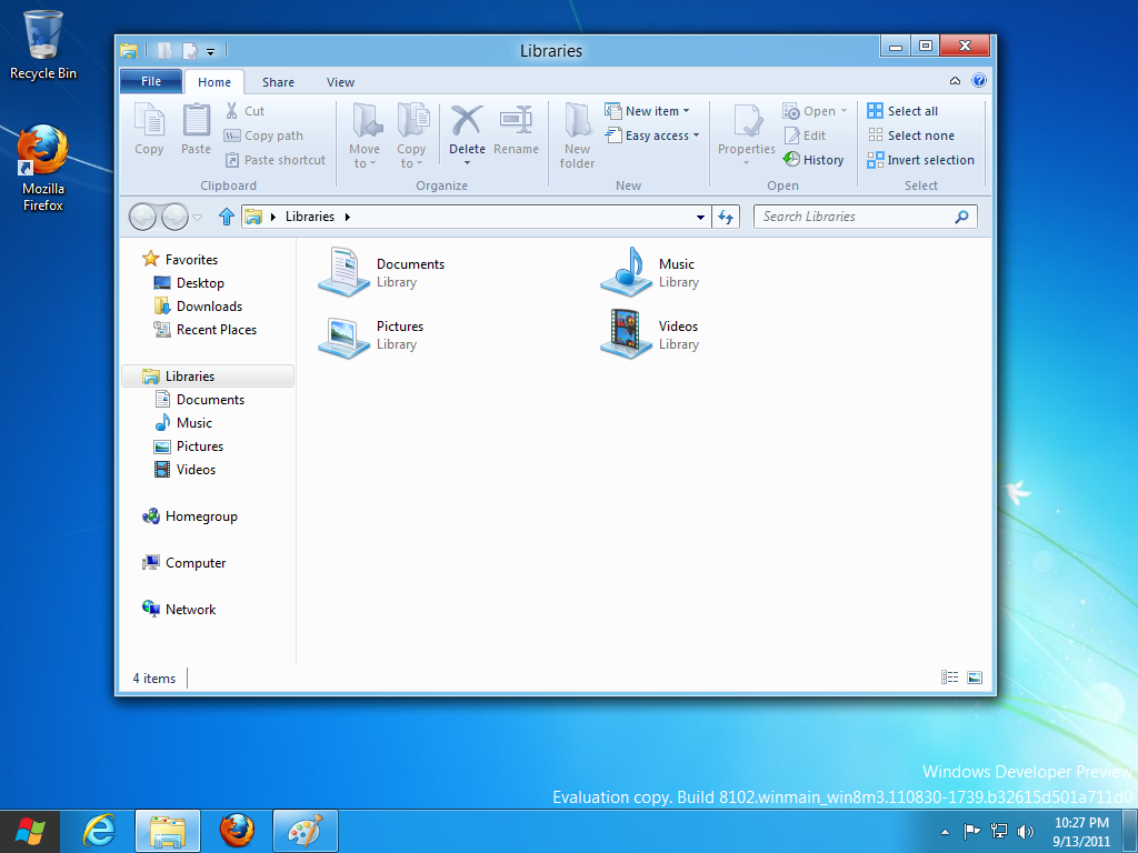
i gotta say though, i think MS is making a HUGE mistake with the interface of Windows 8. try it and see what you think. it's bloody awful, imo. the ribbon in explorer? come on, man! what??
took a screenshot of it:
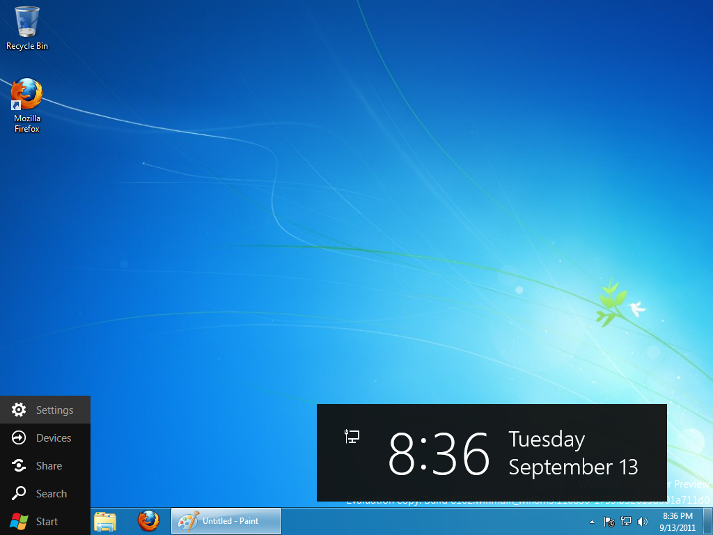
it's more than that though, look at the worthless start menu: (i demand a larger clock!)
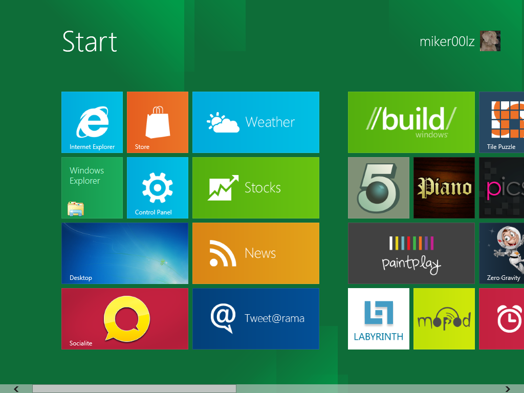
i think this, above, is what they want to push as the main interface... for a tablet, sure this works. for a desktop? HUGE MISTAKE! this is all imo of course. what do you think about this new direction? imo, this is going to crash and burn far harder than vista. i don't even think that interface is especially good for a tablet.
looks like we'll be getting advertising right on our desktop with that. i will be sticking with Windows 7 as long as possible.


